Much of the time since the last post have been spent on the user interface. And one major aspect of that is fonts.
King of Dragon Pass has a
lot of text, so it’s important that text be very legible. Back in 1997, we didn’t have the font rendering technology that we now take for granted. All fonts were bitmaps — just black or empty pixels. Still, it was possible to find fonts that looked decent on screen. Many of them were TrueType or PostScript fonts that came with a specially tuned bitmap version. Those that came with the operating system weren’t good choices for a game, however. Palatino had a decent screen version, but it was just too formal. (And it was only distributed with Mac OS, not Windows.) So we needed to include our own font.
 |
| Pre-rendered Erasmus |
There were plenty of fonts out there, but in 1997, nobody really sold their fonts to be used in a game. You could create artwork using the font, and include that in a game. But King of Dragon Pass had to draw arbitrary text. To do that, it needed the actual font. And the licensing was either insanely expensive or just not available.
 |
| Dynamic Erasmus (bitmap) |
So we found a font we liked in a book of samples, and had our UI artist, Brian Fogel, create a font from it. The font was named Erasmus, and he made a TrueType version for use in static UI elements (which were rendered with Photoshop), and a bitmap version that was used for dynamic text. I always felt that our version of Erasmus managed to be legible, distinctive, and playful — all important.
 |
| Trebuchet (TrueType) |
In 2009 on iOS, font rendering was much, much better — high quality, scalable, anti-aliased fonts. Back then, the choice was limited, and you couldn’t add new fonts. So I chose
Trebuchet. It seemed legible, and was a little playful (e.g. the lower-case ‘g’). But it was a pretty standard font (shipped by both Microsoft and Apple), so I wasn’t completely happy.
We had a second font used for titles and buttons, since a single font can get a little boring. When iOS 4.0 came out and allowed font embedding, I used our Erasmus TrueType font. You can see this in earlier screen shots. But it was always a little thin (if I recall correctly, Brian did some Photoshop tricks when creating captions using Erasmus). There was only one weight in the book, and it was Light (which is essentially a step
away from bold).
As it happens, since King of Dragon Pass came out, one of the large font makers came out with a version of the Erasmus font. In multiple weights, so we could get a less thin version. Except that the licensing terms were still prohibitive. Basically, it was not available to include with a game.
Somehow hoping to find a decent free version, I kept searching the web. It turns out that Erasmus was created by
S. H. de Roos, and he also created an almost identical font, Hollandse Mediaeval. A version of this,
Dutch Mediaeval, was available from
Canada Type with extremely reasonable licensing. So we could basically use the same font, only better!
 |
| Dutch Mediaeval (TrueType) |
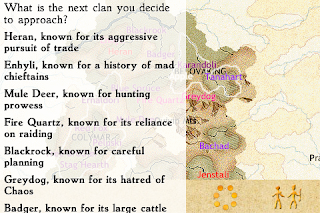
Here’s what the text looks like with Dutch Mediaeval Book (with Bold responses). It’s almost the same width as Trebuchet, but I think it looks a little more interesting.
(By the way, it looks even better on the Retina Display of this year’s iPhone and iPod touch models.)
I’m happy to have what’s essentially the same font as the original game, both for continuity but also because it’s still legible, distinctive, and playful. And really pleased to recommend Canada Type to anyone interested in embedding quality fonts in a game.


